Friends of Notion


Templates that (truly) work


Get 40%-off all premium templates.
Discount auto-applied at checkout.
Limited availability.

Since Notion has made major changes to their database UI (especially the Table view), we'll break down these updates into 3 parts instead of our usual 3 tips/updates.
Let's address the elephant in the room first — properties. The main change is the way they are displayed after clicking the "+ Add property" button.
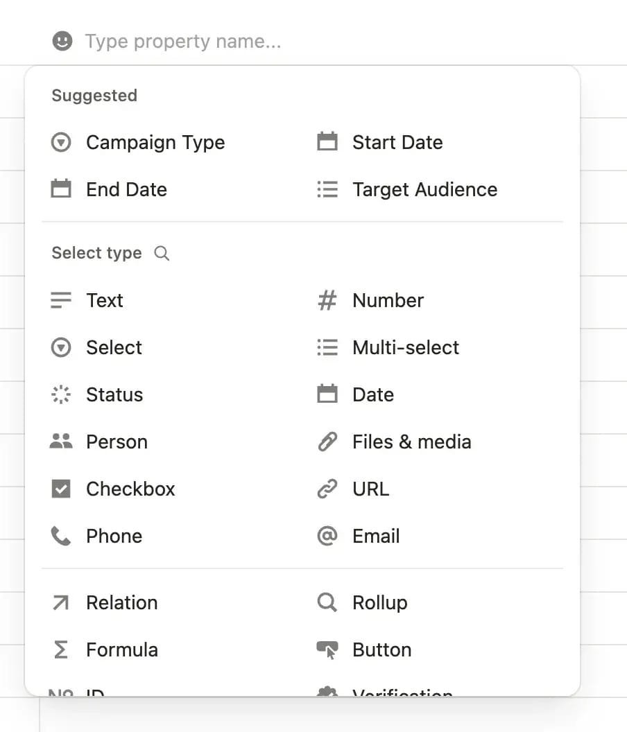
The properties menu has been completely redesigned. When you add a new property, you'll first enter the property name (instead of selecting its type like before). Then you can choose your property type from the list shown above.
At the top, you'll see AI-suggested properties based on your database name and existing properties. Below that are your classic properties, and you can use the magnifying glass icon to search for specific ones.
The properties menu has also changed—clicking any property name opens a new interface that looks like this ↓
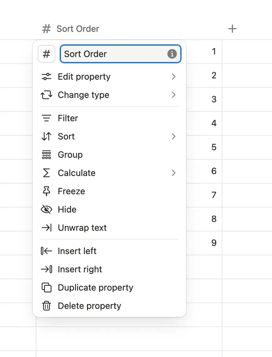
Here's what you can do now:
The Calculate feature has moved to the top menu, though calculations still display at the bottom.
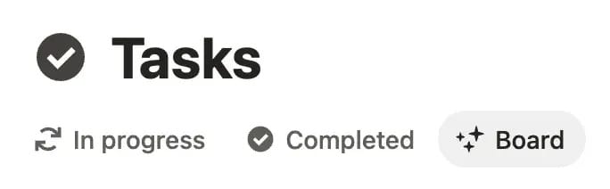
Views have been redesigned and now appear in sleek, rounded gray boxes.
The view settings menu has also changed. The icon is no longer ••• but rather two stacked sliders (which means I'll need to update thousands of pages of documentation 🫠).
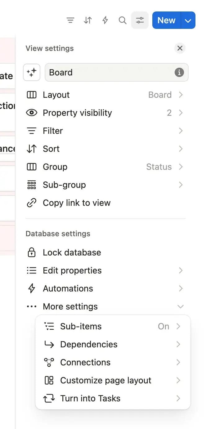
The organization is much clearer now. Classic features like layout, sorting, filters, and grouping are at the top, while advanced options such as database locking, automations, and sub-items are neatly arranged at the bottom.
Other changes worth to mention:
Property Visibility and Edit Properties are now separate options (they were previously combined)••• button) that provides quick access to all settings and database templates in one place.
So—what do you think? Personally, I have mixed feelings: I'm really happy with some changes but really unhappy about others. Here's my breakdown ↓
This site is not a part of the Facebook website or Facebook Inc. Additionally, This site is NOT endorsed by Facebook in any way. FACEBOOK is a trademark of FACEBOOK, Inc.
hello@ramesquinerie.com